


Epidemiologist Behind Highly-Cited Coronavirus Model Drastically Downgrades Projection
Epidemiologist Neil Ferguson, who created the highly-cited Imperial College London coronavirus model, which has been cited by organizations like The New York Times and has been instrumental in governmental policy decision-making, offered a massively downgraded projection of the potential...
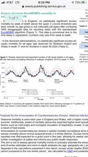
What the what! Could the experts have been wrong? Cue the dramatic music