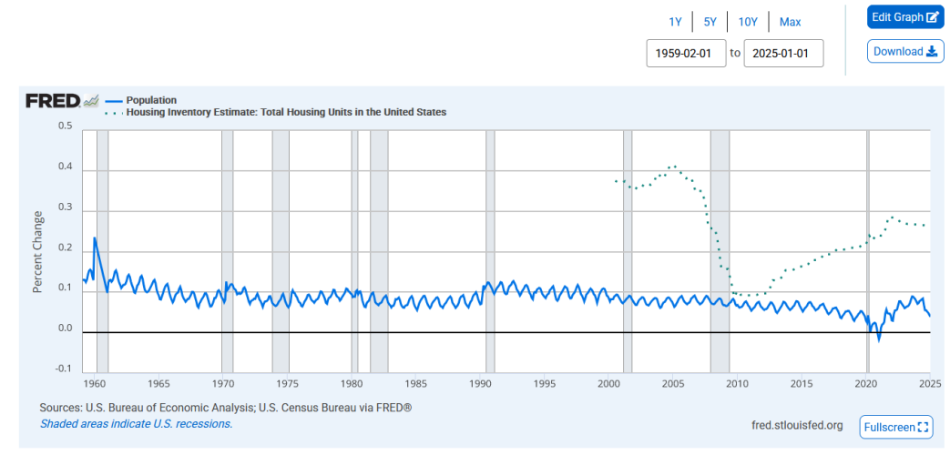
I have to admit that your chart is driving me crazy. The Population line isn't growth (unit change or rate of change), it is population added since time 0, which is 1968ish? Not sure why that year was picked, but it doesn't matter. The new housing units completed is measured the same way. I think the problem is we are starting at the same point, 1968, and same number, 0. This is a poor comparison.
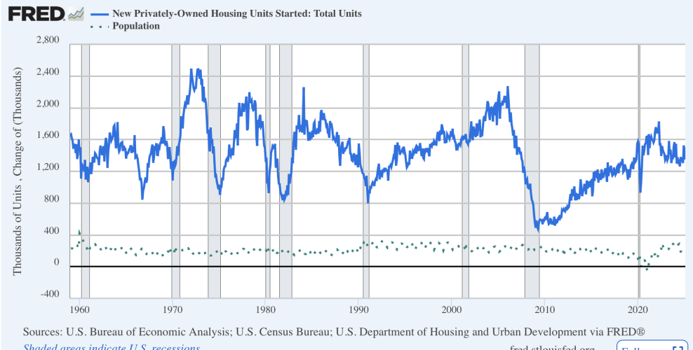
Below in first chart we see new housing starts and changed in total population.
View attachment 364517
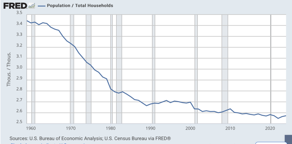
Chart 2 is the ratio of population to households. This shows the problem with you chart. There are 2.6 people per home. So we don't have to grow housing units on a one for one basis. I think this is why it was bugging me.
View attachment 364519
Full disclosure, I have been saying for years that there is no "housing crisis". We have enough houses and starts rates are fine. Housing affordability? Maybe, but when 7% of the population owns more than one home, incomes and incentives might be a good place to start making changes. Building more units on public land is a bad idea, IMO, and won't fix the real problem.






 ). It’ll be years before I feel significant pain.