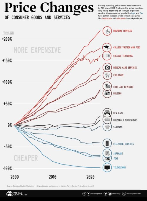
I love that "infographic" when I want to beat on govt involvement

But seriously, there are most likely 3 reasonable explanations - and I would guess it is not any single one, but a mix of the three that account for the observation:
1. Economic inefficiencies driven by government involvement.
2. An average of the upper trend lines reflects a more natural US rate of inflation, but for the downward price pressures of offshore labor.
3. Government increases demand for certain goods/services by making them more available to a larger number of people and this is the expected result from a price/demand curve.
#1 is bad, #2 is what it is, and #3 is probably good in a reasonably fair and stable society.
This leaves us with two big questions as a nation: (A) How do we minimize #1 in the appropriate pursuit of #3; and (B) are we willing to give up the savings in #2 as we seemingly seek to dismantle global trade?